Difference between revisions of "TDSM 6.5"
From The Data Science Design Manual Wikia
| (10 intermediate revisions by the same user not shown) | |||
| Line 17: | Line 17: | ||
---- | ---- | ||
d. A heatmap. | d. A heatmap. | ||
| − | [[File:Heatmap.png]] | + | |
| + | [[File:Heatmap.png| HeatMap for Zillow's Home Value Prediction (Kaggle)]] | ||
| + | |||
---- | ---- | ||
e. A bar plot or pie chart. | e. A bar plot or pie chart. | ||
| Line 25: | Line 27: | ||
---- | ---- | ||
f. A histogram. | f. A histogram. | ||
| + | Source: https://en.wikipedia.org/wiki/Histogram#/media/File:Histogram_of_arrivals_per_minute.svg | ||
| + | |||
| + | [[File:Histogram.png| Histogram]] | ||
---- | ---- | ||
g. A data map. | g. A data map. | ||
Latest revision as of 06:37, 13 December 2017
6-5. Construct a revealing visualization of some aspect of your favorite data set, using:
The following data set was used to construct these visualizations: http://www.data-manual.com/datafiles/movies.csv
a. A well-designed table.
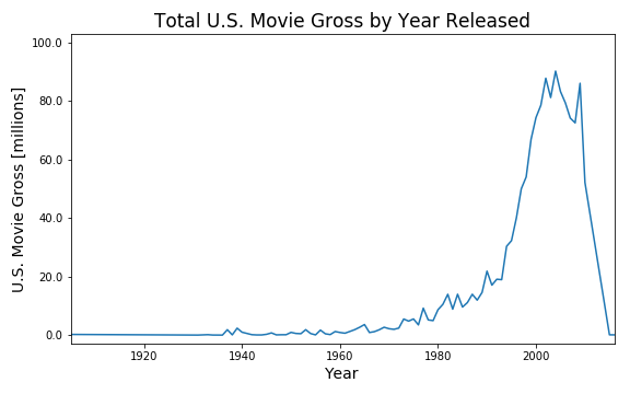
b. A dot and/or line plot.
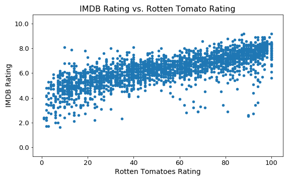
c. A scatter plot.
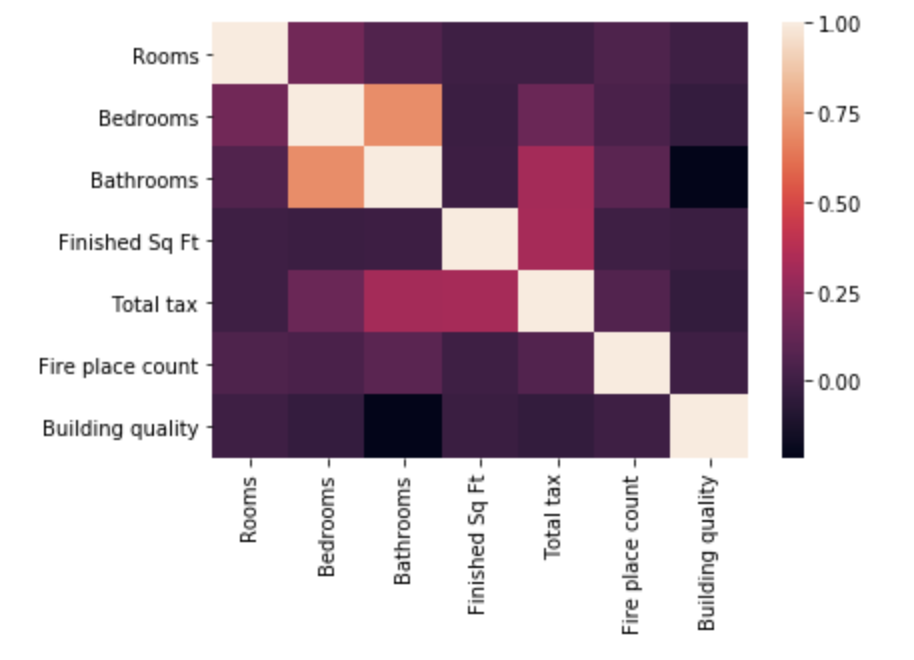
d. A heatmap.
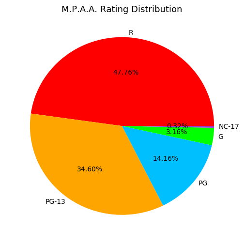
e. A bar plot or pie chart.
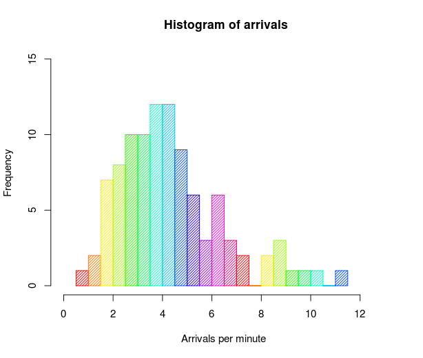
f. A histogram. Source: https://en.wikipedia.org/wiki/Histogram#/media/File:Histogram_of_arrivals_per_minute.svg
g. A data map.
