Difference between revisions of "TDSM 6.7"
(Created page with "'''6-7.''' Construct scatter plots for sets of 10, 100, 1000, and 10,000 points. Experiment with the point size to find the most revealing value for each data set. The follo...") |
|||
| (2 intermediate revisions by the same user not shown) | |||
| Line 1: | Line 1: | ||
'''6-7.''' Construct scatter plots for sets of 10, 100, 1000, and 10,000 points. Experiment with the point size to find the most revealing value for each data set. | '''6-7.''' Construct scatter plots for sets of 10, 100, 1000, and 10,000 points. Experiment with the point size to find the most revealing value for each data set. | ||
| − | The following plots were constructed | + | ---- |
| + | |||
| + | One might suspect that weight would be negatively correlated with age at death due to the various health complications that often come with being overweight. We present various scatter plots of random samples from a baseball player data set. | ||
| + | |||
| + | The following plots were constructed from the "Master.csv" data set in this archive: [http://www.data-manual.com/datafiles/baseballdatabank-master.zip http://www.data-manual.com/datafiles/baseballdatabank-master.zip] | ||
[[File: 6.7.10.png]] | [[File: 6.7.10.png]] | ||
[[File: 6.7.100.png]] | [[File: 6.7.100.png]] | ||
| + | |||
| + | [[File: 6.7.1k.png]] | ||
[[File: 6.7.10k.png]] | [[File: 6.7.10k.png]] | ||
| − | + | Viewing the four plots, the first two can be a bit misleading and make it appear as if there is a strongly positive or strongly negative correlation, respectively. They also show less of the range. The 1k plot shows a more accurate representation of the correlation, but makes the average age at death appear to be greater than it is. While these smaller samples don't accurately represent the entire data set, we can see by increasing the size of the points when there is less data makes it easier to visualize traits such as correlation and density. | |
| − | |||
| − | Viewing the | ||
| − | We can learn a lot more from the 10k plot, which depicts barely any correlation and a wider range. I personally learned two things from this last plot, there was an American with dwarfism named Eddie Gaedel that participated in a Major League Baseball game in the 50's who weighed only 65 lbs<ref>https://en.wikipedia.org/wiki/Eddie_Gaedel</ref>, and that there is a very weak | + | We can learn a lot more from the 10k plot, which depicts barely any correlation and a wider range. I personally learned two things from this last plot, there was an American with dwarfism named Eddie Gaedel that participated in a Major League Baseball game in the 50's who weighed only 65 lbs<ref>https://en.wikipedia.org/wiki/Eddie_Gaedel</ref>, and that there is a very weak negative correlation between the age a baseball player dies and their weight while in the league (the P.C.C. based on this data was -0.0269160733072). It would be interesting to see how this data lines up with people who aren't professional athletes. |
Latest revision as of 04:16, 9 September 2017
6-7. Construct scatter plots for sets of 10, 100, 1000, and 10,000 points. Experiment with the point size to find the most revealing value for each data set.
One might suspect that weight would be negatively correlated with age at death due to the various health complications that often come with being overweight. We present various scatter plots of random samples from a baseball player data set.
The following plots were constructed from the "Master.csv" data set in this archive: http://www.data-manual.com/datafiles/baseballdatabank-master.zip
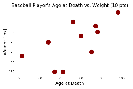
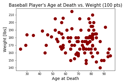
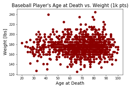
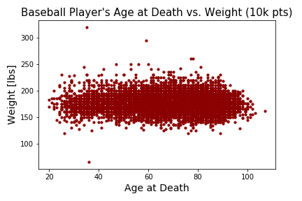
Viewing the four plots, the first two can be a bit misleading and make it appear as if there is a strongly positive or strongly negative correlation, respectively. They also show less of the range. The 1k plot shows a more accurate representation of the correlation, but makes the average age at death appear to be greater than it is. While these smaller samples don't accurately represent the entire data set, we can see by increasing the size of the points when there is less data makes it easier to visualize traits such as correlation and density.
We can learn a lot more from the 10k plot, which depicts barely any correlation and a wider range. I personally learned two things from this last plot, there was an American with dwarfism named Eddie Gaedel that participated in a Major League Baseball game in the 50's who weighed only 65 lbs[1], and that there is a very weak negative correlation between the age a baseball player dies and their weight while in the league (the P.C.C. based on this data was -0.0269160733072). It would be interesting to see how this data lines up with people who aren't professional athletes.


